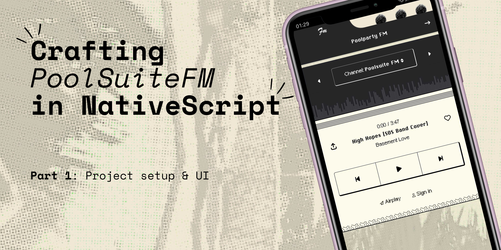
- Poolsuite FM Player in NativeScript, Part 1: Project setup + UI
- Android PoolSuite FM in NativeScript, Part 2: Refining the UI
- Android PoolSuite FM in NativeScript, Part 3: 🎵 Playing the music
Hi folks, I’m a big fan of PoolSuite FM. Unfortunately, there isn’t an Android version available yet. Why don’t we create our own Android version of PoolSuite FM, especially with the help of NativeScript?
In this tutorial series, our objective is to:
- Create simple player controls.
- Make requests, retrieve audio files, and play them. Yes, we’ll definitely play the music! 🎵
- Allow users to switch stations and pause, resume, skip to the next track, or go back to the previous track.
- Develop a cool, retro-style UI, which is a must-have.
Let’s call our app: PoolParty – Unofficial PoolSuite FM player for Android
In this Part 1 of the tutorial we will cover below main points:
- Set up a new NativeScript project using the latest Vue 3 with HMR enabled.
- Try to recreate the player’s UI layout of PoolSuite in NativeScript as simply as possible.
Before we begin, here’s a TL;DR: The full source code and any future updates can be found on GitHub at https://github.com/NewbieScripterRepo/PoolPartyFM.
By the end of this article, the source code for Part 1 will be available in the part-1-ui branch. Feel free to clone it and experiment. Don’t forget to star the repo to stay updated. Let’s get started.
1. Getting started with blank NativeScript Vue 3 project
NativeScript Vue 3 is currently in beta and actively being developed. It will soon be the next major version for NativeScript Vue. Let’s set up our PoolParty project using Vue 3 with the following command:
ns create poolparty --template @nativescript-vue/template-blank@rcAfter command is finished. You should end up with having a nice and clean project like this, with Vue and Tailwind in place.
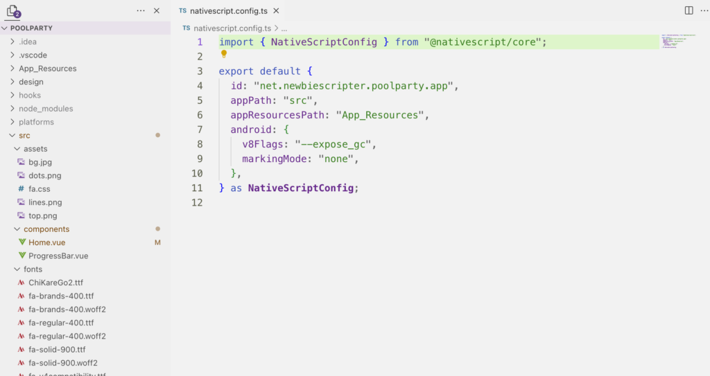
The newly created project can run on both iOS and Android devices immediately, provided your devices are connected. Use:
ns run android
ns run ios
For the sake of simplicity in this series, let’s set aside the iOS version and focus on our primary goal of creating an unofficial PoolSuite for Android.
Even though it is still in beta, I really enjoy working with Vue 3, mainly due to its support for hot module reloading (HMR). Proper hot reloading during development allows me to create UI more enjoyably and greatly improves the developer experience.
1.1. Clean up unnecssary files
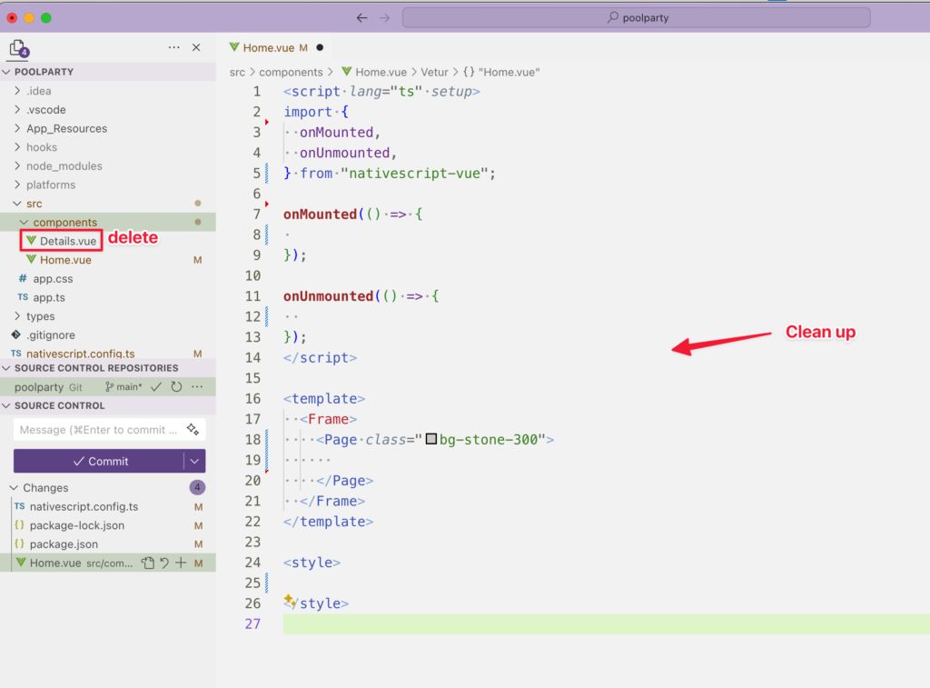
Since this app will only have one screen, clean up the project by removing the default Details.vue file. Delete all the content from Home.vue and use it as the base for our app.
1.2. Get the FontAwesome Icons
We are going to use icons alot through out UI. Thanks to @nativescript-community/fonticon package, this make using fonticon alot easier in NativeScript app. Reference to my other article on how to add FontAwesome to your project here.
Now we have a good starting point for our cool app.
2. Crafting the Player UI
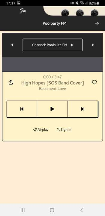
We are now ready to code. Our target would be trying to mimic the retro style of PoolSuite.
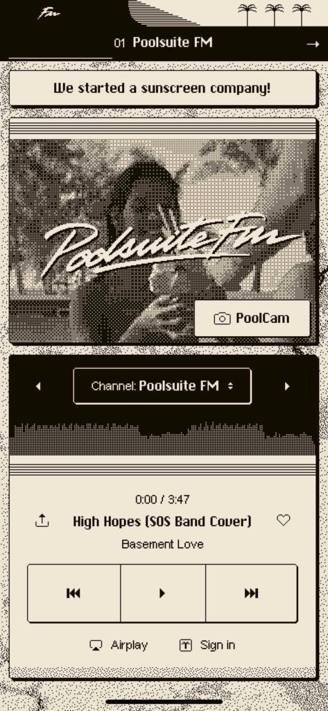
In the scope of this project, our must have components would be:
- A cool retro action bar with “PoolParty” in the title.
- A cool channel selector
- A cool progress bar with waveform (not sure how to do yet)
- A play control
We will have to leave out the PoolCam part, so don’t be sad. Let’s tackle the other UI one by one.
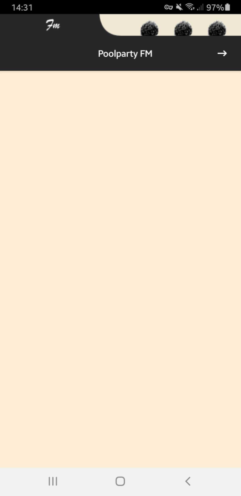
2.1. The action bar
If you isolated the top part of the original PoolSuite FM’s UI, you will see it consist of two parts: a small retro image above the action bar then the action bar with title itself.

We can recreate this easily in NativeScript with <ActionBar> element with help of a <GridLayout> inside.
- For the background color let use:
zinc-800, which is #27272a. It is slightly dark but not completely black .. sound elegant! - And for foreground color, let use: orange-100, which is
#ffedd5. It is slightly yellowish. - (Find more about Tailwind color here: https://tailwindcss.com/docs/customizing-colors)
Here is how you do it.
<ActionBar class="bg-zinc-800">
  <GridLayout rows="37, 60" columns="40,*,40" width="100%">
    <Image
      class="bg-orange-100"
      src="~/assets/top.png"
      col="0"
      colSpan="3"
      row="0"
      height="37"
      width="100%"
      stretch="fill"
    />
    <Label
      class="text-center font-bold text-xs color-orange-100"
      col="1"
      row="1"
      text="Poolparty FM"
    />
    <Label
      class="fas font-bold text-xs color-orange-100"
      col="2"
      row="1"
      :text="$fonticon('fa-angle-right')"
    />
  </GridLayout>
</ActionBar>
Some may found it supprise that we can put other elements inside <ActionBar> element beside <ActionItem>, <NavigateButton>, etc.. You can read more at: https://docs.nativescript.org/ui/action-bar#customizing-the-actionbar
For the image, I drawn one myself you can find it at: https://github.com/NewbieScripterRepo/PoolPartyFM/blob/main/src/assets/top.png
Here is how it turned out:
Depend on your phone setting, you may notice that the statusbar color is white, not black like my screenshot above. That statusbar color on Android can be changed easily by editing ns_primary and ns_primaryDark in App_Resources/Android/src/main/res/values/colors.xml. I set both to #000
2.2. The channel selector & progress bar
Let’s analyze the original design: the layout can be replicated using a GridLayout with 3 columns and 2 rows.
- In the first row, each column will contain a button.
- In the second row, a large rectangular bar will serve as the progress bar. We’ll leave the waveform for future enhancement.
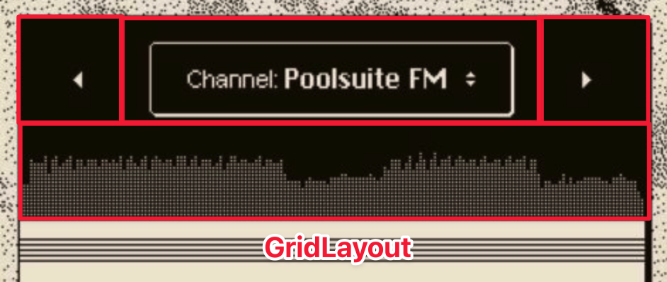
Let’s define our grid as follow:
<GridLayout
  class="pt-3 bg-zinc-800 rounded"
  columns="80,*,80"
  rows="70, 70"
  height="auto"
>
The first row, we will define 3 buttons and put those in each column like this:
<Button
  class="fas text-xs bg-zinc-800"
  color="#fff"
  col="0"
  row="0"
  :text="$fonticon('fa-caret-left')"
/>

<Button
  class="text-sm border border-r-4 border-b-4 border-white rounded bg-zinc-800"
  color="#fff"
  col="1"
  row="0"
  height="40"
  text="$fonticon('fa-angle-left')"
>
  <FormattedString>
    <Span text="Channel: " />
    <Span class="font-bold" text="Poolsuite FM" />
    <Span text="    " />
    <Span class="fas text-xs" :text="$fonticon('fa-sort')" />
  </FormattedString>
</Button>

<Button
  class="fas text-xs bg-zinc-800"
  color="#fff"
  col="2"
  row="0"
  :text="$fonticon('fa-caret-right')"
/>
In web development, I’ve previously used a technique for creating a progress bar using two <div> elements. The outer <div> is set to position: relative, while the inner <div> is set to position: absolute with a different color. By adjusting the width of the inner <div>, you can create the progress effect.
In NativeScript, we can apply a similar approach by using an AbsoluteLayout with a StackLayout inside. This setup would achieve the desired progress bar effect. Here’s how it works:
<AbsoluteLayout colSpan="3" row="1" col="0" class="mt-3 bg-zinc-700">
  <StackLayout
    class="bg-zinc-600"
    height="70"
    top="0"
    left="0"
    :width="progress + '%'"
  />
</AbsoluteLayout>
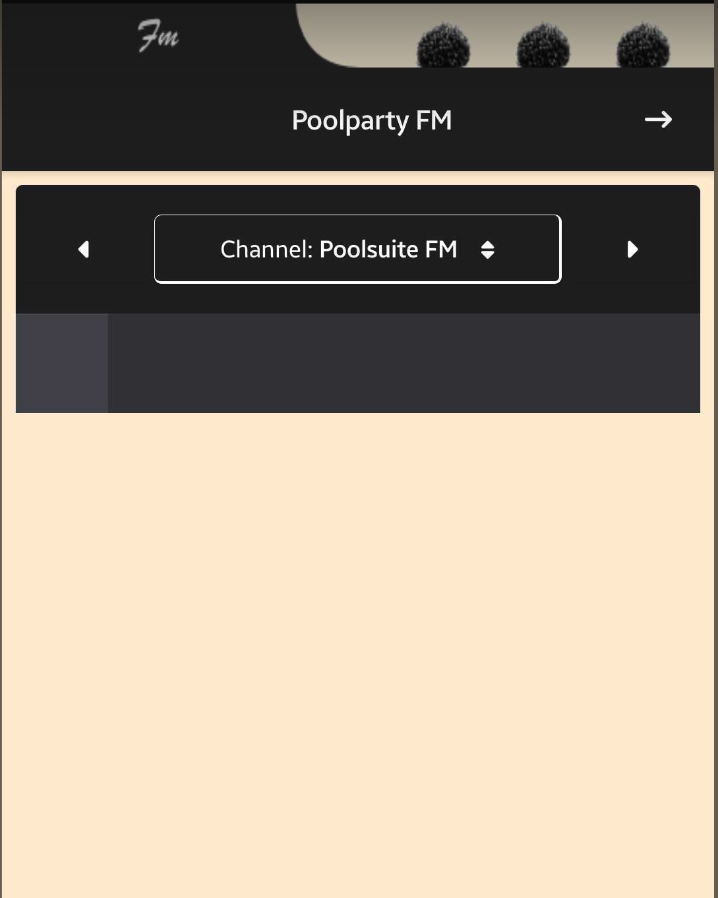
And it turned out pretty well:
2.3. The play control
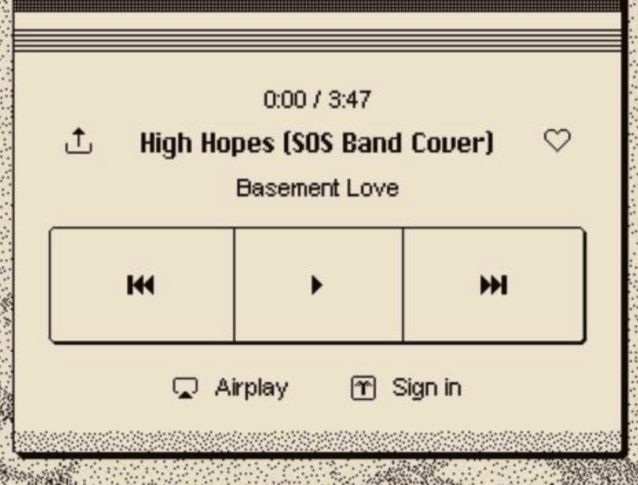
Using the same technique with GridLayout, let’s define another grid with 4 columns and 3 rows to create the look and feel of the play control part. To distinguish it from the background, use a slightly different yellowish color, such as bg-amber-100.
<GridLayout
  class="bg-amber-100 border-4 border-black rounded-b"
  rows="80, 100, 90"
  columns="65,*,*,65"
>
First row, we are gonna have 2 buttons on left and right side which are Share button and Like button. And a center text area to display the current playing song. Which can be easiliy achieved like this:
<Button
  class="fas text-sm bg-transparent z-0"
  color="#000"
  col="0"
  row="0"
  :text="$fonticon('fa-arrow-up-from-bracket')"
/>
<Button
  class="fa text-sm bg-transparent z-0"
  color="#000"
  col="3"
  row="0"
  :text="$fonticon('fa-heart')"
/>

<StackLayout row="0" col="1" colSpan="2" class="py-2 color-black">
  <Label class="text-xs text-center" text="0:00 / 3:47" />
  <Label
    class="font-bold text-sm text-center"
    text="High Hopes [SOS Band Cover]"
  />
  <Label class="text-xs text-center" text="Basement Love" />
</StackLayout>
The second row, we will add 3 buttons which are prev song, play/resume and next song. Again <GridLayout> has our back.
<GridLayout
  class="mx-4 mt-8 border-2 border-r-8 border-b-8 border-black rounded"
  row="1"
  col="0"
  colSpan="4"
  columns="*,*,*"
  height="auto"
>
  <Button
    class="fas text-sm bg-transparent z-0 border-r-2 border-black"
    color="#000"
    col="0"
    row="0"
    :text="$fonticon('fa-step-backward')"
  />
  <Button
    class="fas text-sm bg-transparent z-0"
    color="#000"
    col="1"
    row="0"
    :text="$fonticon('fa-play')"
  />
  <Button
    class="fas text-sm bg-transparent z-0 border-l-2 border-black"
    color="#000"
    col="2"
    row="0"
    :text="$fonticon('fa-step-forward')"
  />
</GridLayout>
In the final row, we need to add two buttons: AirPlay and Sign In. While we won’t implement these functions in this tutorial, we’ll include them in the UI to capture the PoolSuite vibe.
<Button
  class="text-right text-sm pr-4 bg-transparent z-0"
  row="2"
  col="1"
>
  <FormattedString>
    <Span class="fa" :text="$fonticon('fa-paper-plane')" />
    <Span text=" Airplay" />
  </FormattedString>
</Button>

<Button
  class="text-left text-sm pl-4 bg-transparent z-0"
  row="2"
  col="2"
>
  <FormattedString>
    <Span class="fa" :text="$fonticon('fa-user')" />
    <Span text=" Sign in" />
  </FormattedString>
</Button>
And here is our final result:
To be continue …
This article is getting lengthy, so we will pause here for now. The basic UI we’ve created is a work in progress and doesn’t match the polished look of the original PoolSuite FM. In the next part, we’ll work on enhancing our UI to give it a cooler appearance. The next part will be available in a few days. If you’re eager to proceed, check out the latest source code on the GitHub repo.

